Color temperature is the single lighting specification most people get wrong. They buy “warm white” or “daylight” based on a package label and then wonder why the kitchen feels like a clinic or the living room makes everyone look tired. The number on the bulb is not a suggestion. It is a measurable physical property that changes how every surface, every face, and every plate of food appears.
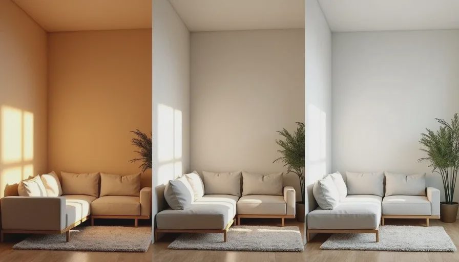
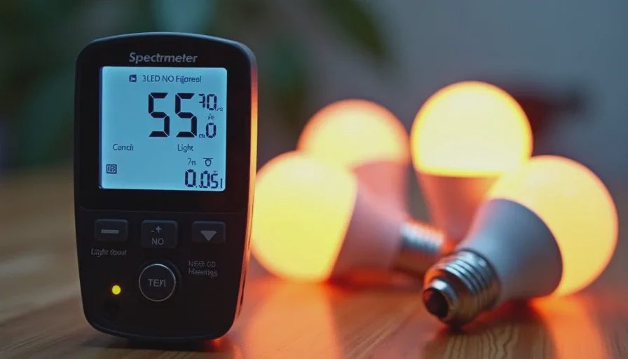
I tested the three most common residential options — 2700K, 3000K, and 4000K — in the same rooms of our 1998 house. Same fixtures, same lumen output, same CRI range (90+ where possible), only the correlated color temperature changed. I used a spectrometer for the hard numbers and lived with each setting for at least two weeks before switching. Mia’s reactions and the way dinner looked on the table mattered as much as the meter.
What the numbers actually describe
Kelvin measures the color appearance of the light itself, not its brightness. Lower numbers lean yellow-red. Higher numbers lean blue-white. 2700K is close to the old incandescent bulb most of us grew up with. 3000K is a modern soft white that still feels residential but less amber. 4000K is neutral-to-cool and is the temperature you see in many offices, hospitals, and big-box stores.
These differences are not subtle once you put them next to each other. A 300-Kelvin jump is clearly visible. The spectrometer confirmed what my eyes already knew: the spectral power distribution shifts enough to change the balance of red, green, and blue light reaching every surface.
CRI sits on top of that. A high-CRI 2700K source still renders colors accurately inside its warm palette. A low-CRI 4000K source can make the same colors look washed out or skewed even though the light itself is cooler. I kept CRI at 90 or above for every test so the temperature effect would not be confused with poor color rendering.
Living room and dining room
2700K made the living room feel finished.
Wood tones deepened. The sofa fabric looked richer. Skin tones picked up a slight golden cast that most people read as healthy. After sunset the room invited people to stay. Conversation stayed low and easy. When I cooked and brought food to the table under 2700K, the seared edges on meat looked properly browned and the greens stayed vibrant without turning olive.
3000K kept most of that warmth but cleaned up the yellow edge.
The same room felt a little more open and a little more daytime. Food still looked appetizing. Skin still looked good. The difference showed up most clearly on white walls and light-colored upholstery — they stayed neutral instead of taking on an amber cast. For a multipurpose living-dining space that sees both evening relaxation and daytime activity, 3000K was the more flexible choice.
4000K changed the character of the room entirely.
The same furniture looked flatter. Skin took on a slightly gray or greenish cast under the cooler spectrum. Food, especially anything with red tones, lost saturation. The room felt brighter even though the lumen output was identical, because the higher blue content increases perceived contrast. Guests sat up straighter. Conversations did not linger as long. It was functional. It was not inviting.
For evening use I now keep the living and dining areas at 2700K or 3000K. 4000K only appears if someone needs temporary task light for a specific job.

Kitchen
The kitchen is where temperature and task performance collide. I need to see the difference between rare and medium, between fresh and slightly off produce, and between a clean counter and one that still has residue.
2700K made the kitchen feel cozy but reduced contrast on the work surfaces. White cutting boards took on a yellow tint. It was harder to judge the exact doneness of meat by color alone. Fine knife work felt slightly less precise.
3000K hit the practical middle. Surfaces stayed clear. Food colors remained accurate enough for cooking decisions. The room still felt like part of the house rather than a laboratory. This is the temperature I settled on for general overhead lighting.
4000K gave the highest visual acuity. Edges were sharper. Whites looked true white. It was excellent for detailed prep. The downside appeared in the evening: after an hour of cooking under 4000K the room felt harsh, and moving from the kitchen into a 2700K living room created a noticeable visual jump. Under-cabinet task lighting at 4000K with warmer ambient overheads solved that problem cleanly.
Bedrooms and nursery
This is the room where circadian effect matters more than aesthetics. Cooler light in the evening suppresses melatonin. Warmer light does not.
I ran 2700K in Mia’s room and our bedroom for the longest stretch. Bedtime routines stayed calm. She did not squint when she looked up at the ceiling fixtures. The light felt soft enough that we could leave a low-level lamp on for night feedings or early-morning wake-ups without fully waking everyone.
3000K was still acceptable but less ideal for pure wind-down. It worked for a reading lamp if the output was low, but as general overhead light it felt a step too alert for the last hour before sleep.
4000K was the clear loser here. Even at reduced brightness the cooler spectrum made the room feel like a waiting area. Mia was more restless. I slept lighter. Once I switched back to 2700K the difference was obvious within two nights.
For any space used primarily after dark for rest, 2700K is the default. If the room also serves as a daytime play or work space, 3000K can be used with the understanding that it should be dimmed or switched off in the evening.
Hallways, bathrooms, and transitional spaces
Hallways connect rooms of different temperatures. Keeping them at 3000K created the smoothest visual bridge. 2700K made the hallway feel like an extension of the living room. 4000K made every transition into a warm room feel like walking into a different building.
Bathrooms are split. Vanity lighting benefits from 3000K to 3500K so skin tones and makeup colors stay accurate. The shower and general ambient light can sit at 3000K without feeling clinical. Pure 4000K at the mirror made faces look slightly ashen; pure 2700K made it harder to see true undertones.
What I actually installed
After the side-by-side tests and the multi-week living trials, the house settled into a simple rule:
Living, dining, bedrooms, nursery: 2700K–3000K, high CRI, deep-baffle or shaded fixtures to control glare.
Kitchen general ambient: 3000K.
Kitchen task and under-cabinet: 3500K–4000K.
Bathrooms: 3000K ambient, 3000K–3500K at the vanity.
Hallways: 3000K to keep transitions calm.
I avoid mixing temperatures inside a single visual field. A 4000K pendant over a 2700K dining table creates a constant low-level visual argument. Consistent temperature within a room, and gentle steps between rooms, keeps the house from feeling patched together.
The spectrometer numbers confirmed what living in the spaces already showed. 2700K supports rest and makes people and food look their best in the evening. 3000K is the practical residential workhorse. 4000K is a tool for clarity, not a default for the whole house. Choose the temperature for the activity and the time of day the room is actually used. The package label is only the starting point. The room tells you the rest.




No comments yet — be the first to share a thought.